If you exist in the world of the Internet, you will know. Some Websites are too easy and appealing to visit and many others are very complicated and non-inviting to a visitor. Too many ads, too complicated design, junk things on the pages – all make even an excellent website go useless. There are many mistakes which we are most likely to make while designing a website and these mistakes should be totally avoided. In this article, we shall see 9 Mistakes that you should not do while designing your website, thus increasing the chances of converting a visitor into a customer.
Before that, we shall see some of the reasons why few websites annoy the visitors.
a)- The Website doesn’t load fast.
b)- Too many ads which open multiple windows at once.
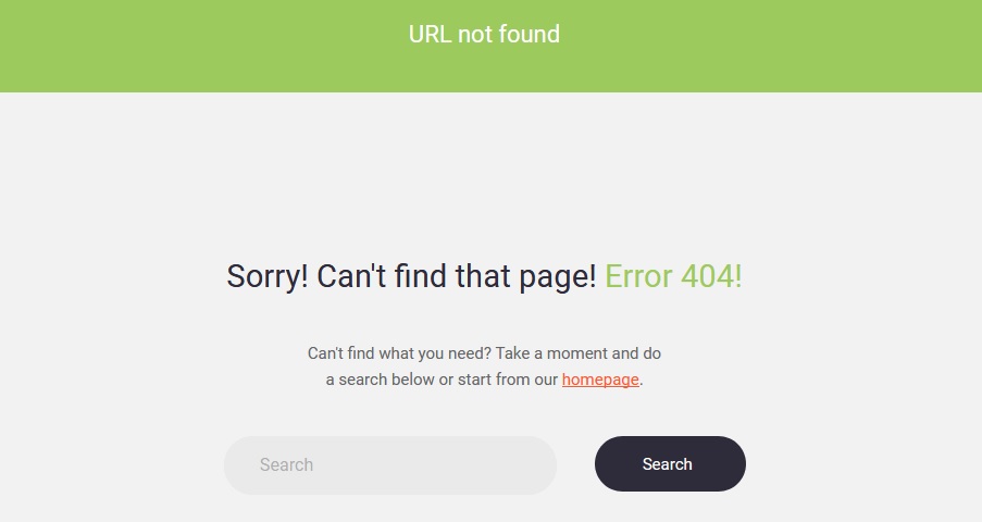
c)- A page opens into a 404(Page not found the error).
d)- If the content of your website does not match with what you have advertised it.
With these things in mind, we shall go ahead with the mistakes that you should avoid while designing your website and for this, make sure you hire a competent web designer USA.
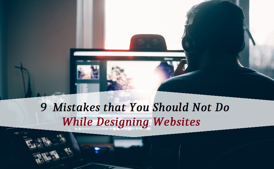
9 Mistakes to Avoid While Website Designing
Let’s start with the mild ones first.
1. Not Linking with your Social Media Accounts
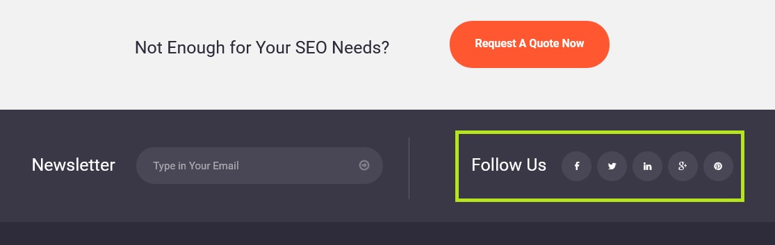
With the internet growing each day, many people tend to follow the people or companies they admire on the social network platforms like Facebook, Twitter, etc. So, whether you are just a contributor or an owner, make sure you include links for your social network accounts and also remember to regularly update those accounts.
2. Invisible Contact Information
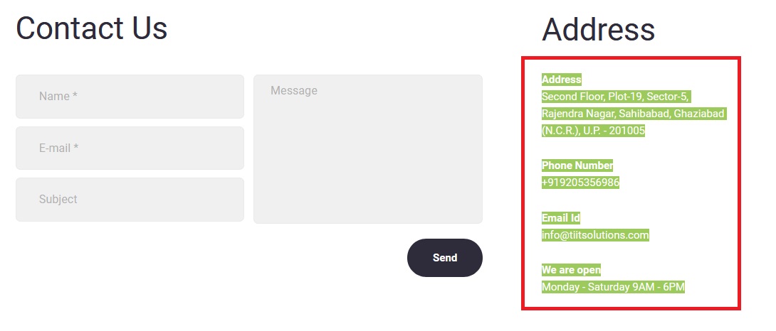
If you host your business website, make sure you include an About Us page and a page with your contact information. This also will not be sufficient. Let your contact information appear at the bottom of every page so that the visitor doesn’t have to go the first page to every time he/she needs to contact you. Let it be obvious.
3. Too Many Colors and Fonts

Avoid using too many colors and fonts on your pages as these will distract the user. Both the factors should be decided based on the target audience. For example, if your website targets young children, keeping it very colorful is a good idea but if your website targets professionals, keep it simple and professional.
Now, with hose mistakes that moderately annoy people.
4. Outdated Information
What could be more annoying when you find your favorite DVD on a company’s website available for sale, but after you call them up, they say its unavailable. So, whether your website is an informative one or a business website, update it as and when something changes like when something runs out of stock so that your user knows exactly what is available and what is not.
5. Improper Navigation

If the users can’t figure out where exactly to go after a page and/or if they need to go a few pages back to find the next page, it’s a waste of time. They will just get frustrated and then go to some other page which will be your competitor’s website. So, always include a navigation bar at the top having links to the home page and other related pages. Also, include a sitemap so that the users get to know where they are and where to go next.
6. Lost Pages
Every page in your website should have a link to the home page so that those of your users who would like to share the URL with their friends can easily do so and also, they will be able to get back to the home page, in case they feel lost,
7. Slow Server Times
Nothing is more annoying if a website takes forever to load. So, constantly maintain your server and reduce the images and videos as much as possible if your website is taking too long to load. An estimate by Akamai Technologies is that an average user waits for about 4 seconds for a page to load before jumping to the competitor sites.
Now, the most annoying errors that will definitely turn a visitor away from your website forever.
8. Disabling The Back Button
Most users feel annoyed if they cannot go back from the current page. Developers do this for one reason – there might be something that the user does not want to see or click on, but the website is paid by the third party to do so. They might contain ads or links to games and so on.
Another similar annoying thing is the popping of malicious ads occupying the entire screen. They usually ask for permission to download some software or app to the user’s computer or mobile phone. This destroys the reputation of the website. So, be careful when you allow companies to post ads on your website.
9. Opening New Windows For Every Page
It was once a new thing to have multiple frames opening for each page on the website. But now it is more than annoying to have multiple windows open for a single website. It consumes large resources of the system, thus making the system respond slower. Plus, closing them becomes a huge task once the user is done with his/her job on your website.
You need not to worry, as the users can always open the pages in new tabs if they wish so, thanks to the multi-tabbed interface of the web browsers these days.
There are much more things to avoid like annoying malicious ads telling the users that if they click install, their phone and/or computer will speed up. Just ensure that you have some control over what kinds of ads are put up on your website.
So, this was the list of 9 mistakes you should ask your web designer USA to avoid in order to keep your visitors coming and sharing your website. If avoided, your website should promise your customer the best browsing experience and you a better inflow of visitors and/or customers.
Looking for a best professional graphic design company in India? BUTTERCUP Advertising Studio helps you to create your best graphic design and magazine design services to your business.

Never miss a story..!!
Grab the Latest SEO & SMO News, Tips, Updates & Trends..!!
See Our Blogcenter
Want to share your thoughts with our readers? Learn how to become a contributing author
Photo by Glenn Carstens-Peters